Page rollup
This block can be used for many purposes, for example:
List news in different ways; a news center, new news, latest news etc.
Most read pages.
Most commented pages.
Popular pages.
Underused pages.
Pages with a certain variation (for example a language).
Created but unpublished pages.
Various page statistics.
Various rollups that authors and editors can benefit from.
Part of a news letter implementation.
Part of an event management implementation.
For implementation examples, see this page: Page rollup implementation examples
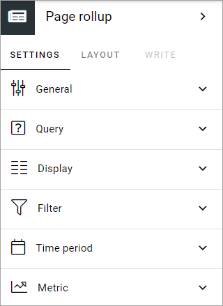
Settings
These settings are available for the block:
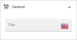
General
Here you can add a title for block:
Query
You can choose to pick a number of pages to display in the rollup, or use the query builder.
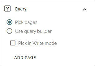
Pick pages: To be able to pick some pages in Design mode, select this option.
Pick in Write mode: Select this option if authors should be able to pick pages in Write mode. Note! If you select this options, the ADD PAGE option is not available in the settings.
ADD PAGE: When you have selected “Pick pages”, you can pick some pages to always be displayed in the list. Click this option and use the page picker. See this page for more information: Page picker
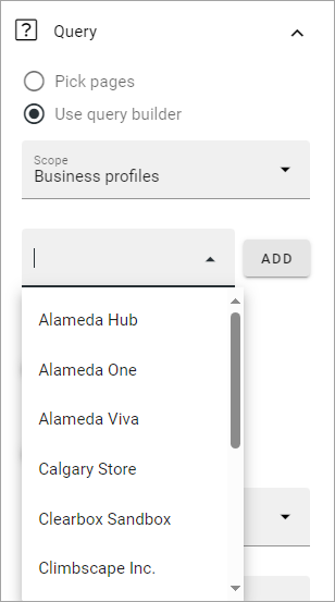
For query builder, the following options are available:
Scope: When you have chosen to use the query builder, select scope for the block. This is where you choose where to get the pages from. You can select:
Tenant.
Business profiles.
Apps.
Page collections.
Navigation path.
Channels.
When you have selected apps, business profiles, channels or page collections, as the next step, you choose one or more to get the pages from.
The following settings can then be available, depending on scope chosen:
ADD FILTER: Available for scope Tenant. Use it to add filters, to further decide what should be shown in the rollup.
Cache on client: This setting can be used to speed up rendering on subsequent page loads. This is is done by storing data in the browser cache. Default: selected.
Current user subscription: Available for scope Channels. Select this if only the pages that the logged in users subscribes to should be displayed.
Current node/Custom: Available for scope Navigation path. Choose the start point for the navigation path to be displayed. If you select “Custom”, you can use the page picker to select start node.
Exclude current page: Available when you have chosen scope for the query builder. The default setting is to exclude the current page, but if you, for some reason, would like to include the current page, uncheck this option.
Exclude start node: Available for scope Navigation path. If the start page selected should not be displayed in the block, select this option.
Exclude variations: Usings this option, you can exclude varations from the query. Not available for Navigation path.
Filter by user subscription: Available for scope Channels. Select this if the list should display only thos channels the logged in user follows.
Navigation depth Level: Available for scope Navigation path. Choose the number of nodes that should be displayed, including the start node.
Page size: Use the slider, or type the number (1-99) to set the number of items (pages) that should be displayed on each “page” of the list. Also see under Display below for additional settings for the list.
Status: By using this option you can create rollups for pages with the status Never published, Published or Any status.
Trim duplicates: If more than one Page Rollup block is added to a page, this option can be used to handle duplicates between the blocks. When the option is selected, you can enter a number indicating the priority for duplicates, for this block. If you set “1” for a block it means this block has priority showing a post that would have been a duplicate. Note! If you select this option paging is not available.
Custom date filtering
If the scope is filtered on some kind of time property, custom date filtering can be set.
See this page for more information about custom date filtering: Custom date filtering
Tip: Pages with a specific variation only
If just pages with a certain variation (language or other variation) should be listed in the rollup, it can be done this way:
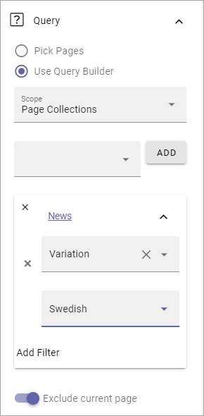
Only news in Swedish will be listed in this example.
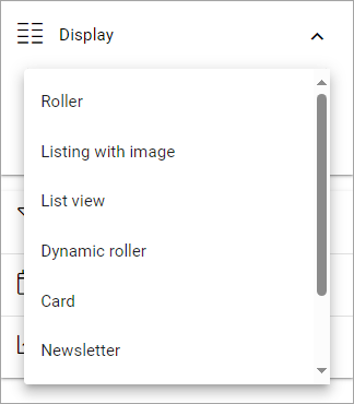
Display
Select View here. Note that a preview is shown in the block.
The following lists all available display settings, first the common ones and then some that are specific for a view.
Options for most views
These options are available for most views, shown in different order for different displays, here listed in alphabetical order:
Date: Select the property that contains the date for the item(s) to display. Available for Roller, Listing with image, Dynamic roller, Card and Newsletter.
Dialog image: Select image to display, if any. Available when ypu have selected “Open page as a dialog”.
Fixed header: Available for List view. When this option is selected, the heading will always be shown when scrolling.
Hide block when no data: Select this option if the block should be hidden when there’s nothing to display.
Hide if read: Select this option to hide all pages the logged in user has visited. This affects all pages, including news.
Highlight non-read: This option makes sure non-read pages are highlighted. Default=selected. Deselect if you don’t want that.
Image: Select the property that contains the image for the item(s) to display. Available for Roller, Listing with image, Dynamic roller, Card and Newsletter views.
Image ratio: Select ratio for the image; Landscape, Square or Wide. Available for Roller, Listing with image, Dynamic Roller and Newsletter.
Link label: Add the text to be shown for the link here. Available only if “Show link” is selected.
Link URL: Add the URL to open when a user clicks the link. Available only if “Show link” is selected.
Max display limit: Available only for scope Navigation path, for all views. Set the number of pages that should be displayed.
No result text: Enter the text that will be shown if no page can be displayed.
Open in editor: Available for all views. If this option is selected, a page link can be clicked to open the page in edit mode. This options was devolped with rollups for editors and authors in mind. Permissions apply, so if a user without any edit permissions for the page opens a page this way, nothing can be edited.
Open in new tab: If the link should be opened in a new tab (as opposed to in current window or dialog), select this option.
Open page as a dialog: If the page should be opened in a dialog instead for in a page (new or current), select this option.
Padding: Add some padding between the list and the block border, if needed.
Paging: Select paging here; “No paging”, “Classic” or “Scroll”. Available for List view, Dynamic roller, Card and Newsletter. Note! If you select “Trim duplicates” under Query, paging can’t be used (= it’s automatically set to None).
Show A-Z paging: If you would A-Z paging to be available for users, select this option. Available for List view, Card and Event list.
A-Z paging property: Available when “Show A-Z paging” is selected. You must select a property here for the A-Z paging to work. For more information, see below.
Show likes/comments: If the number of likes and comments should be displayed for the item, select this option. Available for Roller, Listing with image, Dynamic roller and Card.
Show link: You can add a link button at the bottom of the list. The first page collection is default, but you can link to any target.
Sort by: Choose what the list should be sorted by, and then select ascending or descending. Available for all, except Navigation view. For the Navigation view you can also sort on Navigation.
Summary: Select the property that contains the page summary for the item to display. Available for Listing with image, ListvView, Dynamic roller, Card and Newsletter.
Roller
Contains general settings only, see above.
Listing with image
Contains mostly general settings, see above. The only special setting is:
Show rating: If the rating for the page(s) displayed should be shown, select this option.
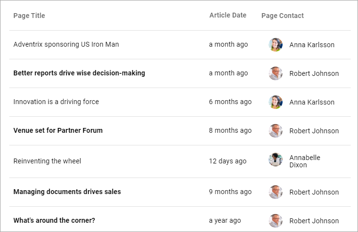
List view
Contains mostly general settings, see above. The only special setting is:
Show Export to Excel: If it should be possible for users to export a list to Excel, select this option. When this is done, an “Export to Excel” button is shown.
You also have to add at least one column, for the display to work. See below for more information.
Dynamic roller
The special settings for this view are:
Autoplay: If the roller should roll automatically, select this option.
Delay between slides: Set the time between slides in milli seconds.
Loop: Normally a roller stops when the last post is reached (and can restart after a short while). When this option is selected, there is no “end” and the roller just keeps rolling. Important note: When Loop is selected the arrows users can use to roll “manually” are not shown.
Number of slides to display: Select number of slides, 1-12.
Show paging: Small icons shown that users can use to page back and fort. See image below for an example.
Show anvigation: If navigation icons for the users to use for rolling should be shown, select this option.
Slider size: Select the size of the slider here: Small, Medium, Large or Extra large.
Slider type: Select Horisontal slider or Vertical slider.
For the general settings, see above.
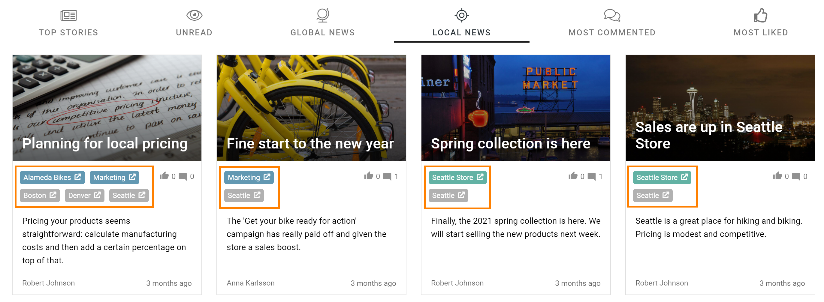
Card
The special settings for this view are:
Preview: Select the property to base the preview on. It can be either a media property or a document data property.
Cards per row: As it says, set the number of cards to show per row. Important note! The card’s placements are based on a grid with 12 positions. Therefore only numbers that is an integer part of 12 is available, for example 1,2,3,4 and 6.
Show last activity: If you seect this, the last activity for the page, if any, will be displayed on the card.
Person: This option can be used to show properties in Card view.
Show page type: If this option is selected, the page type used for the page is shown as metadata, the same way as other properties.
Show rating: Use it to show the page’s rating in the card.
Term properties: Can be used to show properties in Card view. Click “Add” and select a property. Continue the same way for additional properties.
For general settings, see above.
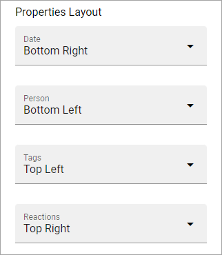
You can also choose where properties for date, person, tags and reactions (if added) will be placed. Use these settings:
Event List
As it suggests, this view is suitable for use in a Event Management set up. Contains general settings only, see above. You also have to add at least one column, for the display to work. See below for more information.
Calendar
The special settings for this view are:
Start date/End date: You can select a property for start date and a property for end date.
Default calendar type: Can be Month, Week or Day.
Enable calendar type dropdown: Makes it possible for users to select Month, Week or Day.
Default time: Select a defaul time from the list.
Include time: Select this to display time for events in the calendar.
Weekdays: Select what is to be considered as work days in the calendar.
Event color: Here you can choose enterprise glossary properties to display in the calendar view.
Event height: Use the slider to set height for the events in the calendar. See a preview in the block.
Height: Use the slider the set the height for the whole calendar. See a preview in the block.
For general settings, see above.
Page creation settings for Calendar display
It’s possible to create pages from the calendar view, useful for publishing campaigns, for example. To use this option, it must be activated and some settings needs to be done. They are found under the heading PAGE CREATION. You may also need/want to edit some settings in the page collection(s) where pages created from here are stored.
Note! You must still select something under Query for the Calendar display to be shown. You could for example just select “Tenant” as Scope.
Note! All permissions and all settings for the page collection where a new page is STORED always apply. That is true for which colleagues have permissions to create a page and settings for scheduled publishing and if approval is needed, for example.
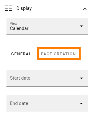
When Enable page creation has been turned on, the following settings are available:
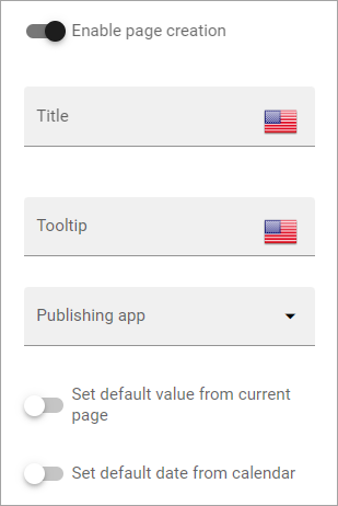
Title: Add a title for the button used to create pages.
Tooltip: A tooltip for the button can be added here.
Publishing app: Choose a publishing app where a new page should be created. Select “Any publishing app” to let the author choose app.
Page collection: Shown when you have selected a publishing app. Select page collection within the app. You can choose “Any page collection” to let the author choose. When creating page templates, “Dynamic” is a useful option, as the template then can be used in different page collections.
Set the default value from current page: This is a suggested setting the author can change. If a default value for a property in the new pages, should be set from this page, select this option and then select property. This can be useful for rollup purposes, for example, when all new pages created from this view share a property value.
Set the default date from the calendar: This is also a suggested setting the author can change. This is simliar to the above, but concerning date properties. An example: if Article date is selected as property, the article date for the new page will be set from the calendar, the date that was clicked to create the new page.
When page creation from the calendar is set up, an author can create a page by clicking a date, and the option to create a page is available, for example:
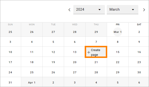
As the first step, the author selects where to add the new page. Available options depends on settings in the block. The author can also choose to edit the settings for “Set the default value from current page” and “Set the default date from the calendar”.
In this example, settings in the block states that a new page should be created in the current publishing app and that the author can select page collection.
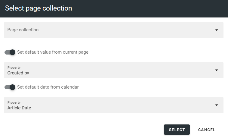
After that, the creation of the page works as usual, see: Create a page
If the purpose is that new pages should be created (or rather published) on specific dates, for example for a campaign, scheduled publishing should be used.
See this page for information on how to activate scheduled publishing: Page collection settings
See this page for information on how to use scheduled publishing: Filter options for blocks
More information about A-Z paging
For A-Z paging to work, one or more Queryable properties must be activated for this functionality.
For more information on the property settings, see: Queryable properties
There’s more information on this page as well: General block settings
Adding columns
For “List view” and “Event list”, you have to add at least one column, for the display to work. Here’s an example with three columns added for List view:
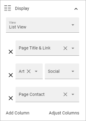
This could show the following:
Some examples and tips
“a month ago” etc is the “Social” setting for date. If you would like to show exact dates instead, select “Normal”.
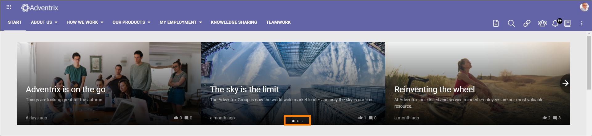
“Show paging” in settings for “Dynamic roller” makes these icons available for navigation:
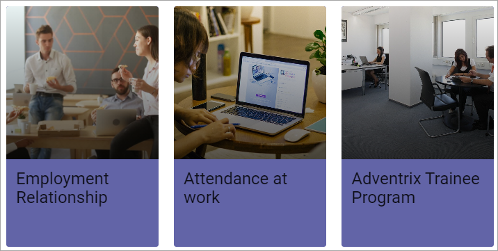
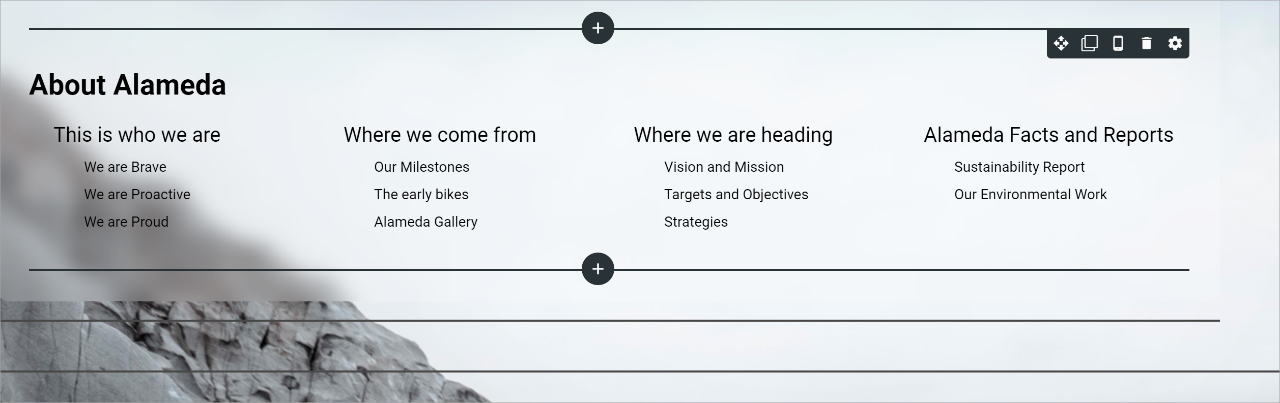
Here’s a simple example of a Card view used for navigation purposes:
Card view can now display sub pages if the scope “Navigation path” is used. Here’s an example:
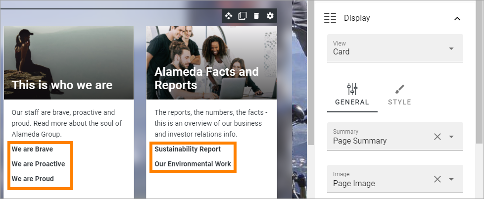
The card view also supports a dynamic number of properties that can be displayed on the card. Here’s an example:
The Navigation view can be used to display a mega menu style navigation. Here’s an example of a page rollup used for this purpose:
Style settings
For Roller, Dynamic roller and Card, extra style settings are available, for example (Card):
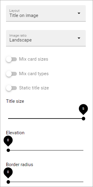
and these:
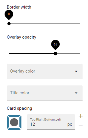
Most options should be self explanatory, just try out these settings. A preview is shown in the block.
A few notes, though:
Mix card sizes: When you select this option, the cards can be displayed with different sizes, which can change every time the page is updated/opened. Note that you must have selected “Mixed” under “Layout” for this to work fully.
Mix card types: Select this option if you would like an automatic mix of card types. Card types are remixed every time the page is loaded. If you click this option on and off a few times while you work with the settings, you can see the mix changing. If you select “Mixed” for “Layout”, this option is not available.
Static title size: If the size of the title always should be the same on all cards, select this option.
Colorful: Available for some Layout options. It’s really colorful! Try it and see what you think.
Filter
The filters available are the same in most blocks, see: Filter options for blocks
Time Period
These settings where called “Social period” in earlier Omnia versions. The following settings are available here:
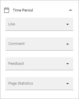
Use these settings to decide the time period calculated for any of these options. If you don’t select anything, it means “No limit”. You can select one week or one month instead.
Metric
Using these settings you can show a metric in the block displaying the number of pages that is valid for the query settings. The metric can then be clicked to display the page rollup you have set up.
This can for example be used to create a rather compact page or section with different metrics in different blocks. The user can then click the desired metric to see the full list.
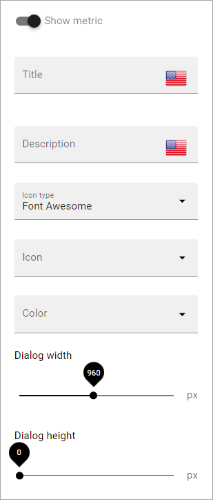
Show metric: Select this to decide to show the metric (and the settings below becomes available).
Title: Add a title for the metric if needed.
Description: A description for the metric can also be added.
Icon type/Icon: Select an icon type and an icon, if you want to.
Color: This sets the color for the divider above the metric.
Dialog width/height: Set width and height for the dialog displaying the list of pages.
Layout and Write
The WRITE tab is not used here. The Layout tab contains general settings, see: General block settings