Filter options for blocks
All filter and refiner options for blocks, are now found under Filter. A-Z paging is an exception, see below.
Exactly which options will be available for filtering will depend on the type of block and sometimes other options already selected. This page describes common options.
Here’s an example of available filter options:
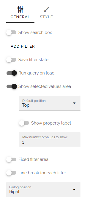
Show Search Box: To add a search box, select this option. You can do that without selecting any other options.
Add filter: To add filters, click this link. See below for more information.
Save filter state: If you select this option the filter keeps it’s state in the page url as long as the page is active, and will be activated when the user goes back to the page, by using the browser’s Back button. The url can also be copied and for example be used to prepopulate the rollup.
Run query on load: Decide if the query should be run on load, so the list is filled with when the user enters the page, or not. If there are a lot of requests, an effective solution could be to show a search box and not use this option.
Show selected values area: Select this option to show the filters chosen.
Default position: Available when “Show sleceted values area” is selected. Can be Top, Left, Right or Dialog.
Show property label: Available when “Show sleceted values area” is selected. If selected, the property label is shown as meta data.
Max number of values to show: Available when “Show sleceted values area” is selected. Using this option you can set the maximum number of values to be displayed before a “Show more”. Deafault setting is 0, which means show all.
Fixed filter area: Select this option to set the filter area as fixed area when scrolling, meaning the filter area will be displayed all the time when you scroll down in a list.
Line break for each filter: If you want each filter on it’s on row, select this.
Dialog position: You can choose to place the dialog Left or Right.
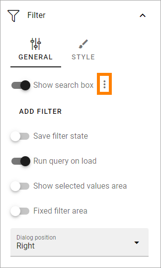
Settings for search box
If you added a Search Box a number of options becomes available under a dot menu:
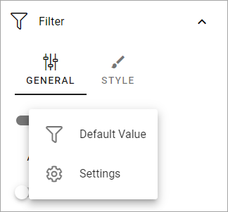
Default value
Here you can add a default value for the search field, which means a prepopulated search result.
Settings
This can be available under Settings for the search box:
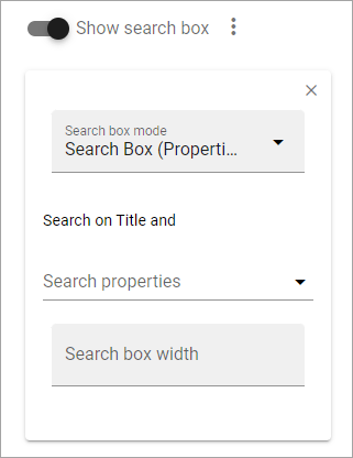
Search box mode: Can be earch based on properties or a full text search.
Search on Title and…: If search should be possible on anything else than the title, add the property here.
Search box width: Yes, no doubt about what this setting does.
Add filter
To add filters, do the following:
Click ADD FILTER.
Open the list and add a property to filter on.
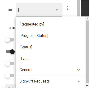
It can be a quite long list. You can press any key to go to that part of the list, for example P to go to properties starting with Page.
Some properties may have additional options, which you normally can choose (not mandatory) for more detailed filter options, available under a dot menu.
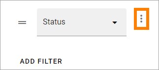
Here’s an example:
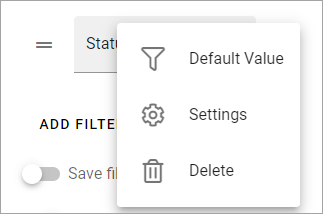
Default Value: You can add a default value for the search field.
Settings: Choose “Settings” to show the following three options.
Filter Type: Can be Dropdonn or List.
Defult position: Can be top, Left, Right or Dialog.
Fixed filter width: The filter width is per default dynamic. Set a value here to make the filter width fixed.
Delete: Click to delete the filter.
A-Z paging
In Omnia 7.10, this option was called A-Z filtering and worked a bit differently. In 7.11 and later it’s now found as an option for some views under Display (meaning not available under Filter). When used, a list can be filtered on any of the letters that exist in the data set. The property to base A-Z paging on is selected.
And it’s not just A-Z. If a language contains special letters in the alphabet, meaning other letters than A-Z, A-Z paging works for those letters as well, and for numbers, if applicable.
Here’s an example where A-Z paging is used:
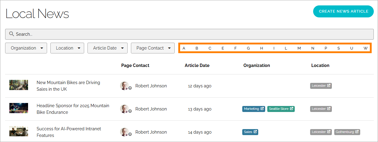
In this example, not all letters exist in that data set, for example D and J, and those letters are then simply not shown as filters. To filter, the user just clicks a letter.
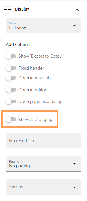
And here’s an example from settings of a Page rollup. In this rollup, A-Z paging can be made available for the views List view, Card and Event list.
You then must select the property to base the A-Z paging on. In this list, all properties made available for this functionality is shown. If there’s just one property in the list, you must still select it for A-Z paging to work in this rollup.
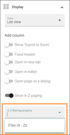
To be available in the above list, all applicable queryable properties must be set up in Omnia admin, see: Queryable properties
Style options
the following options are available for filter style:
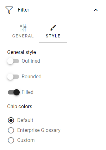
General style: Should be self explanatory.
Chip colors: Here you can set colors for the selected values:
Default: sets a color contrasting the background for good visibility.
Enterprise Glossary: will use these settings.
Custom: you can set custom colors for the chip colors for this block specifically.