Teamwork rollup
Use this block to list team sites and other teamworks, including projects, the user has access to. Here’s a simple example:
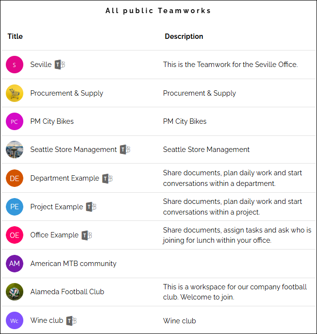
Icons can indicate if a Teams group, Viva Engage (former Yammer) or Facebook workplace group is connected to the teamsite. Users can click the icon to go to the group. In the image above a Teams group is connected to some of the team sites.
Settings
The following settings are available for the block:
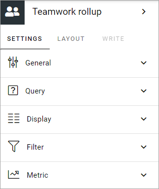
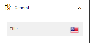
General
You can add a title for the block here, in any tenant language.
Query
Here you can set the following:
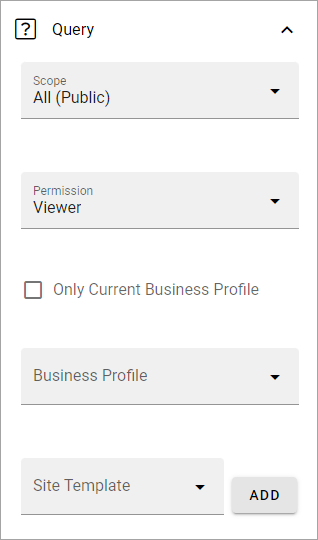
Scope: Select scope, for example All, Followed or Member of. (See more information about this below.)
Permission: Used for security trimming. For more information, see: Security trimming in app rollups
Only current business profile: If only teamworks from the current business profile should be listed, select this option.
Business profile: Another option is to select a specific business profile. If you do not select any business profile here, all teamworks in the tenant can be listed, that is not private.
Site template: Here you can set one or more types of teamwork to be shown in the list.
Regarding Scope, here’s more detailed information:
Note that the first three scopes only include teamwork connected to Omnia that are assigned a provisioning template and can be found in the Teamwork list within Omnia admin.
All (public): All teamwork app instances where “Show in public listings” is checked. (Omnia database).
Followed: All followed teamwork app instances. (Omnia database).
Last visited: All last visited teamwork app instances. (Omnia database).
All (SharePoint sites): All sites in SharePoint. (SharePoint search).
Followed (SharePoint sites): All followed sites in SharePoint. (SharePoint social API).
Member of (Office 365 groups): Member of Office 365 groups (MS Graph).
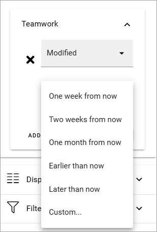
Custom date filtering
If the scope is filtered on some kind of time property, custom date filtering can be set.
Here’s an example on where it can be available:
See this page for more information about custom date filtering: Custom date filtering
Display
Select a view (List view or Navigation view) and use the following settings (image from Omnia v7):
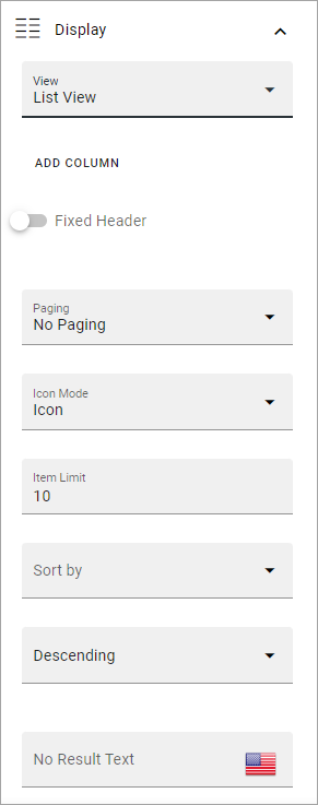
(All options are not shown in the image but are described below.)
Add column: If you select List View, you must add at least one Column for the display to work. (Navigation view is fixed regarding the columns to display).
Fixed header: Select to always show the header when scrolling.
Paging: Select how paging should work; “No paging”, “Classic” or “Scroll”.
Icon mode: For Icon mode you can select “Letter avatar” or “Template icon”. In the example images at the top, Letter avatar is selected.
Item limit: Set the number of sites to be shown on each “page” of the list.
Sort by: Select what to sort the list on, and then select Ascending or Descending sorting.
No result text: You can add a text that is shown if the query should result in nothing to display. Add in any avaiable tenant language.
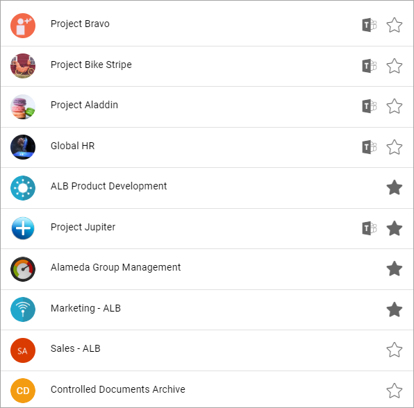
Show follow status: Follow status is indicated by a star, filled if the teamwork is followed, hollow if not, see below for an example.
Open in new window: For some (maybe all) of of the teamworks, it can be a good idea to open the link in a new window.
Padding: You can add some padding between the block’s borders and the list.
Here’s an example of a Navigation view with follow status shown:
Filter
Filter options are the same in most blocks. For more information, see: Filter options for blocks
Metric
Using these settings you can show a metric in the block displaying the number of teamwork that is valid for the query settings. The metric can then be clicked to display the teamwork rollup you have set up.
This can for example be used to create a rather compact page or section with different metrics in different blocks. The user can then click the desired metric to see the full list.
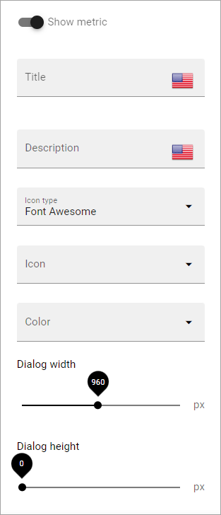
Show metric: Select this to decide to show the metric (and the settings below becomes available).
Title: Add a title for the metric if needed.
Description: A description for the metric can also be added.
Icon type/Icon: Select an icon type and an icon, if you want to.
Color: This sets the color for the divider above the metric.
Dialog width/height: Set width and height for the dialog displaying the list of pages.
Layout and Write
The WRITE TAB is not used here. The LAYOUT tab contains general settings, see: General block settings