Settings for sections
The following settings are available when working with sections:
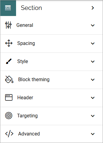
General
What you can set under General depends on the section type selected; Column, Tab, Accordion, Stepper and Reusable.
General settings for a section with columns
For a section with columns, the following can be set:
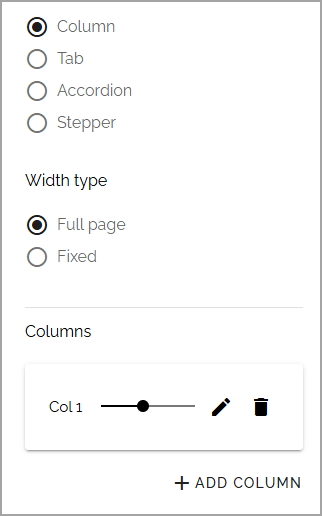
Width type: Set dynamic width (“Full Page”) or a fixed width in pixels. When you have selected “Fixed”, a slider is shown where you can set the width.
Columns: Using the slider, set the width for a column. Default = same width for every column. Here you can also click the pen to set a minimum width for a column.
Add column: You can add a column if needed. The same settings as above can then be used for the new column.
To remove a column, click the dust bin.
General settings for a section with tabs
For a section with tabs, the following can be set:
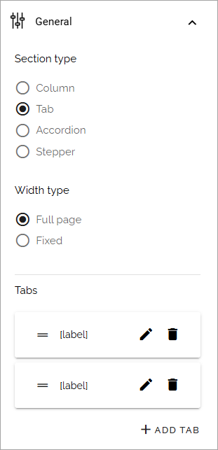
Tabs: Here you can edit the settings for each tab, by clicking the pen. See information about these settings below.
Width type: Set dynamic width (“Full Page”) or a fixed width in pixels. When you have selected “Fixed”, a slider is shown where you can set the width.
Add tab: Ta add a new tab, click here. You edit the settings as described below. To remove a tab, click the dust bin.
By clicking the pen, the following can be set for a tab:
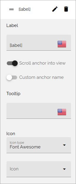
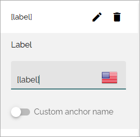
Label: If a label should be shown for the tab, add the label here. You can add a label in any tenant language.
Scroll anchor into view: To have the anchor for this section automatically scrolled into view, select this option.
Custom anchor name: Here you can set a custom anchor name, if needed. For more information, see below.
Tooltip: If a tooltip should be shown for the tab, add it here.
Icon: First select the icon type and then select the icon in the list below, if an icon should be shown. (If no icon should be shown, just don’t select an icon, it doesn’t matter that an icon type is selected.)
Set a custom anchor name
Anchor names are created automatically for sections with type Tab, Accordion and Stepper, based on the label. When you have entered a label, you can set a custom anchor name, if needed.
For a section with tabs you can, for example, set a custom anchor name for each tab.
See this page for more information on how to use anchors: Using anchors
General settings for an accordion section
For an accordion section, the following can be set:
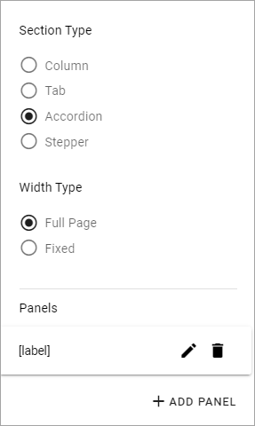
Width type: Set dynamic width (“Full Page”) or a fixed width in pixels. When you have selected “Fixed”, a slider is shown where you can set the width.
Panels: Here you can edit the settings for each panel, by clicking the pen. See information about these settings below.
ADD PANEL: Ta add a new panel, click here. You edit the settings as described below. To remove a panel, click the dust bin.
By clicking the pen, the following can be set for a panel:
Label: If a label should be shown for the panel, add the label here.
Tooltip: If a tooltip should be shown for the panel, add it here.
Icon: First select the icon type and then select the icon in the list below, if an icon should be shown. (If no icon should be shown, just don’t select an icon, it doesn’t matter that an icon type is selected.)
If needed, you can set a custom anchor name for each accordion post, the same way as for a section with tabs, see above.
General settings for a stepper section
For a stepper section, the following can be set:
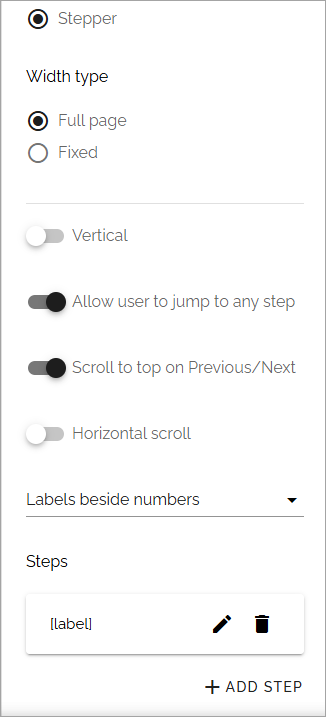
Width type: Set dynamic width (“Full Page”) or a fixed width in pixels. When you have selected “Fixed”, a slider is shown where you can set the width.
Vertical: To show the steps vertically instead of horisontally, select this option.
Allow user to jump to any step: If this option is selected, users can go to any step ny clicking the label, if not, users can only go to the next or the previous step.
Scroll to top on Previous/Next: If this option is selected, the step page is always shown from the top, when users goes to next or previous. If not selected, no scroll is made.
Horizontal scroll: Here you can decide how the steps will line up within the section. With this option NOT selected (Default), the steps are spred out over the whole section area. With this option selected, a horizontal scroll will be used to go between the steps. This can be especially useful with more than 5 steps.
Labels beside numbers: Decide if labels should be used besides number and if so, where; No label, Labels beside numbers, Labels below numbers.
Steps: Here you can edit the settings for each step, by clicking the pen, see below.
ADD STEP: Ta add a new step, click here.
When editing steps, you can add or edit a title, and set a custom anchor name, if needed.
For more information on custom anchor names, see above.
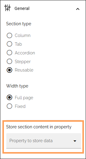
General settings for a reusable section
When you have selected “Reusable”, available in Omnia 7.11 and later, you must select a property for storing the content:
For more infomation, see:
Spacing
Here you can set the following:
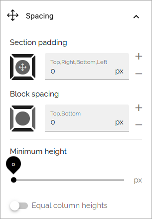
Available options depends on section type chosen.
Section padding: Here you can set some padding within the active section.
Column spacing: Here you can set the spacing between the columns in this section. Available if section type Column is selected.
Label padding: For an accordion section, you can set label padding. Available if section type Accordion is selected.
Block spacing: You can set spacing between blocks in this section.
Minimum height: You can make sure that this section always has a minimun height, regardless of what is shown in the section. Use the slider to set the minimum height in pixels.
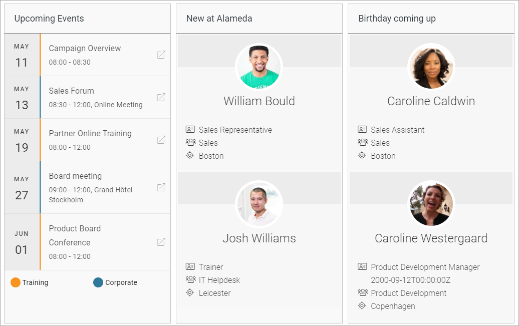
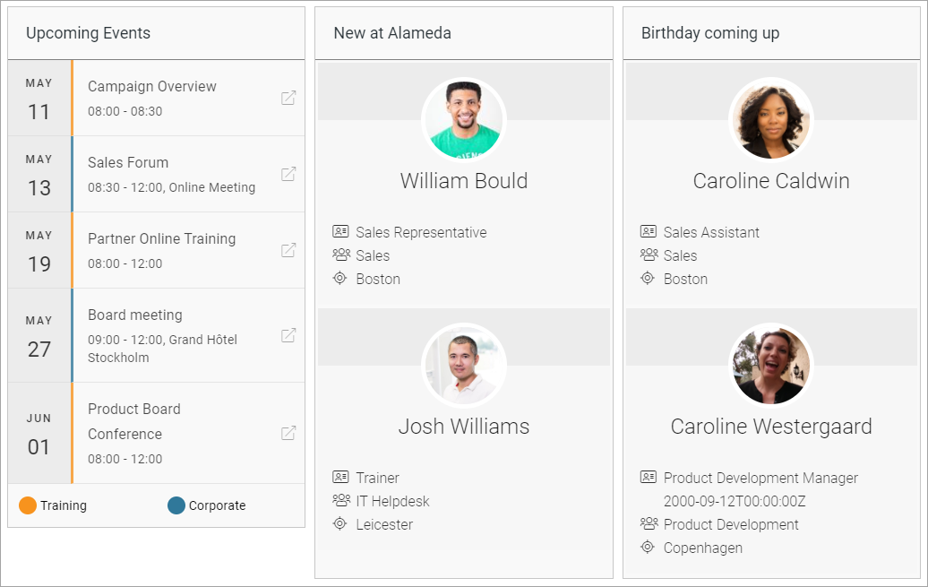
Equal column heights: This option is a way of making sure a layout with more than one column or section is balanced. When this option is selected, all adjacent sections has the same length. See below for examples.
Here’s an example with “Use full height” on:
And here’s the same page with the option off for the left section (Upcoming Events):
Style
Available settings for style can vary depending on section type. The options available for all section types are the following:
and these:
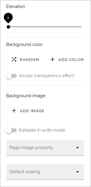
Elevation: With this setting you can make the content of the section “stand out” from the page. Use the slider to set how much.
Background color: A default background color for sections are set in Omnia admin. You can set another background color for this section here, if needed. You can try out RANDOM or set the color using ADD COLOR.
Background image: Another option is to use an image as background in this section. When you click “Add image”, the media picker starts. See this page for more information: Media picker
Editable in Write mode: As default, Design mode is needed to edit background image. If it should be possible using Write mode as well, select this option.
Page image property: Here you can select a property to get the page image from.
Default scaling: You can select a default scaling for the images, but this can be changed by an author (Write mode). Possible scalings are set up in Omnia admin.
Force default scaling: Select this option to make sure images always are scaled using the default scaling set above. If you do, scaling can not be edited using Write mode.
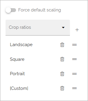
Crop ratios: Crop ratios are set up in Omnia admin for the media picker. Here you can decide which of these should be available for authors to use in this section. To add a crop ratio, select it in the list and click the plus. To remove a crop ratio, click the dust bin. You can also set the order in which the crop ratios are shown, by drag and drop.
For more information about crop ratios, se this page: Media picker settings
Style settings for a section with columns
Only the common settings, see above.
Style settings for a tab section
If it’s a section with tabs, you can set all the common settings, and also:
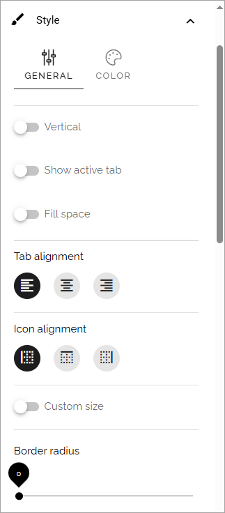
Vertical: If the labels for the tabs should be shown vertically, select this option.
Show active tab: If the active tab should be indicated, select this option.
Fill space: If the tab labels should fill the available space, either horisontally or vertically, depending on what you have chosen, select this option.
Tab alignment: Here you can set alignment for the tab labels.
Icon alignment: If you are using an icon you can set icon alignment within the available space for the icon.
Custom size: If you would like to set minimum height and width for the tabs, select this option, and then use the sliders.
Border radius: Use this slider to set the border radius between tabs in the section.
Style settings for accordion section
If it’s an accordion section, the following Style settings can be set, in addition to the common ones:
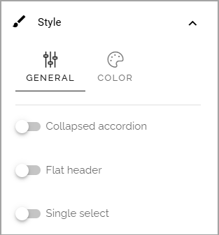
Collapsed accordion: If this option is selected, all accordions will be collapsed when the page is loaded.
Flat header: Per default, the tab is slightly elevated. Select this option to make it flat.
Single select: When this option is selected, only one accordion can be open at a time. When a user expands an accordion, any other accordion that may be open is closed.
Style settings for stepper
For a stepper section, only the common settings are available, see above.
Effects
Additional effects are avilable here, for all section types:
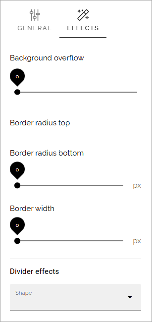
Try them and see the effect - a preview is shown in the active section.
And don’t forget to test Divider effects - there are some really cool effects in that list.
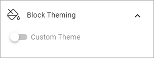
Block theming
Theme for blocks are set up in the business profile settings. If you would like to change them for this section, select “Custom theme”:
What you can select here is the same as for the whole page, see: Layout theming
Header
Here you can set the following:
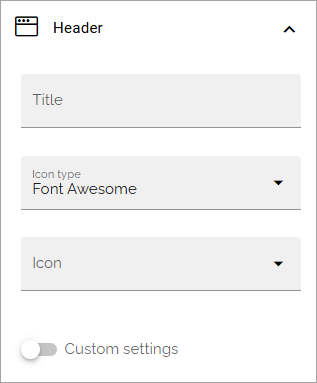
Title: If you want a title to be displayed for the section, add it here. Not mandatory. You can add a title in any tenant language.
Icon type/Icon: If you would like to use an icon, first select type and then an icon from the list.
Custom settings: If you don’t want to use the global settings for the business profile, for this section, Select “Custom settings” (selected in the image above).
The global settings are set in Omnia dmin, see this page: Content header (Business profile)
When selecting custom settings, the following is available:
This is the same settings as content header settings for the business profile, see: Content header settings (Business profile)
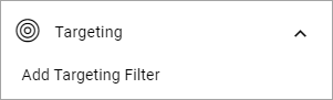
Targeting
A section can be targeted by using this setting:
Targeting for a section works the same way as targeting in many other parts of Omnia. See this page for more information: Using targeting
Advanced
The following settings are found here:
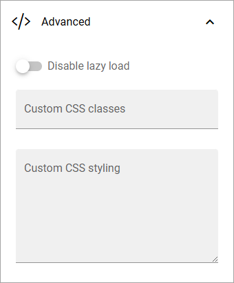
Disable lazy load: If you need to disable lazy load for this section, select this option. Note that you set this for the active section only. If you need to do this for other sections on the page, repeat the process.
Custom CSS classes/Custom CSS styling: If you know how, you can use these fields for custom styling, for the active section.