Content header (Business profile)
Use these options to set a default setting for block headings and section headings. Authors can edit these settings when working with blocks and sections, if needed.
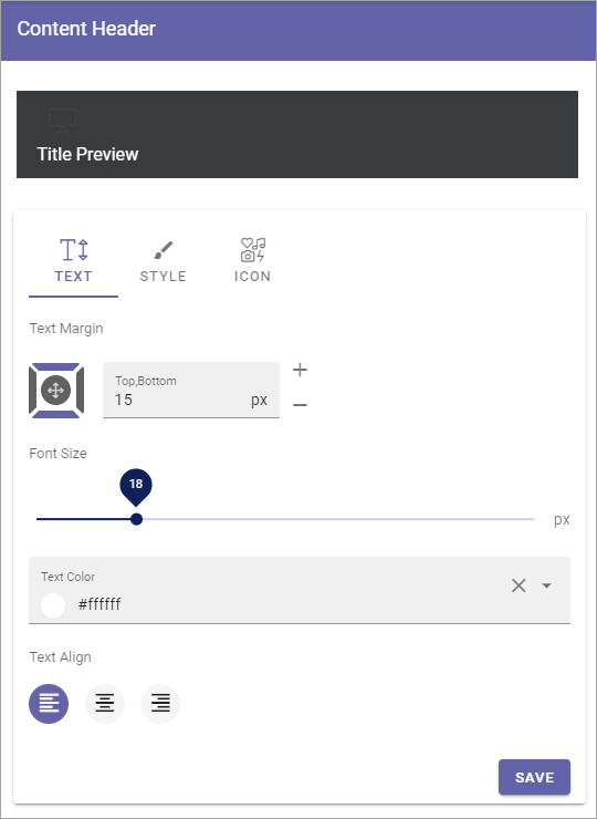
Title preview: Here you see a Preview when you make changes.
Text
Available settings for text are the following (as seen in the image above):
Text margin: Set the margin from the text to the border of the header.
Font size: Use the slider to set the Size of the text here.
Text color: Set the text color here.
Text align: The header text can be aligned left, right or middle, within the header.
Style
You can use these settings for style:
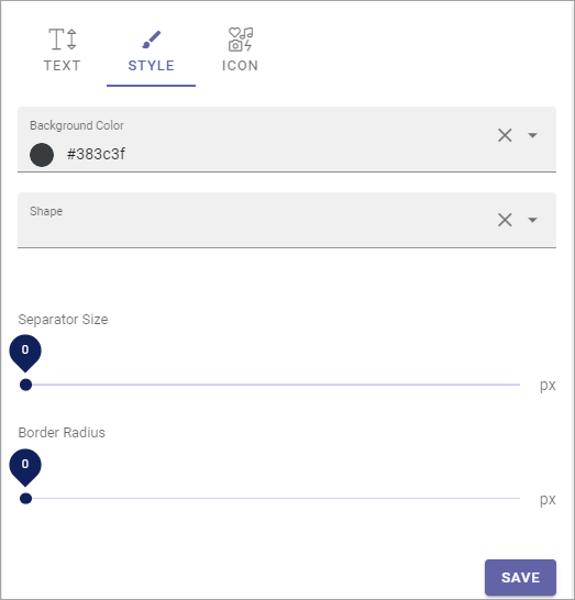
If you make changes, you can see a preview of them at the top.
Background Ccor: You can set a default background color here, for the content header.
Shape: You can also add a shape from the list, if you wish.
Separator size: This is spacing in pixels below the heading area (meaning, not just the text, but the whole header).
Border radius: Use this slider to set rounded corners. It affects the top left and top right corners.
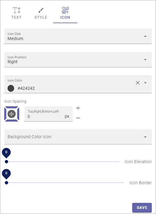
Icon
Here you can edit default settings for icons, when icons are used in a block or region heading.
Icon size: The size of the icon can be set to Small, medium, Large or Extra Large.
Icon position: Position can be Left, Top Left, Right or Top Right.
Icon color: A color for the icon can be set here.
Icon spacing: If you need some spacing around the icon, set it here.
Background color icon: If needed, you can set a background color for the icon.
Icon elevation: Use the slider to set aniIcon elevation, if you want that.
Icon border: Use the slider to add an icon border, if you want that.